Visual Identity for a student society
Client:
Scope:
Industry:
Year:
Põhjala – Estonian Students Society
Visual Identity, Brand Guidelines
Academic
2025
EÜS Põhjala is one of Estonia’s oldest student societies, recruiting new members twice a year through universities and digital channels.
As a new member of the organization, I took on the role of designer, and the task of bringing consistency to a visual identity.
CLIENT: Põhjala – Estonian Students Society
SCOPE: Visual Identity, Brand Guidelines
INDUSTRY: Academic
YEAR: 2025
EÜS Põhjala is one of Estonia’s oldest student societies, recruiting new members twice a year through universities and digital channels.
As a new member of the organization, I took on the role of designer, and the task of bringing consistency to a visual identity.
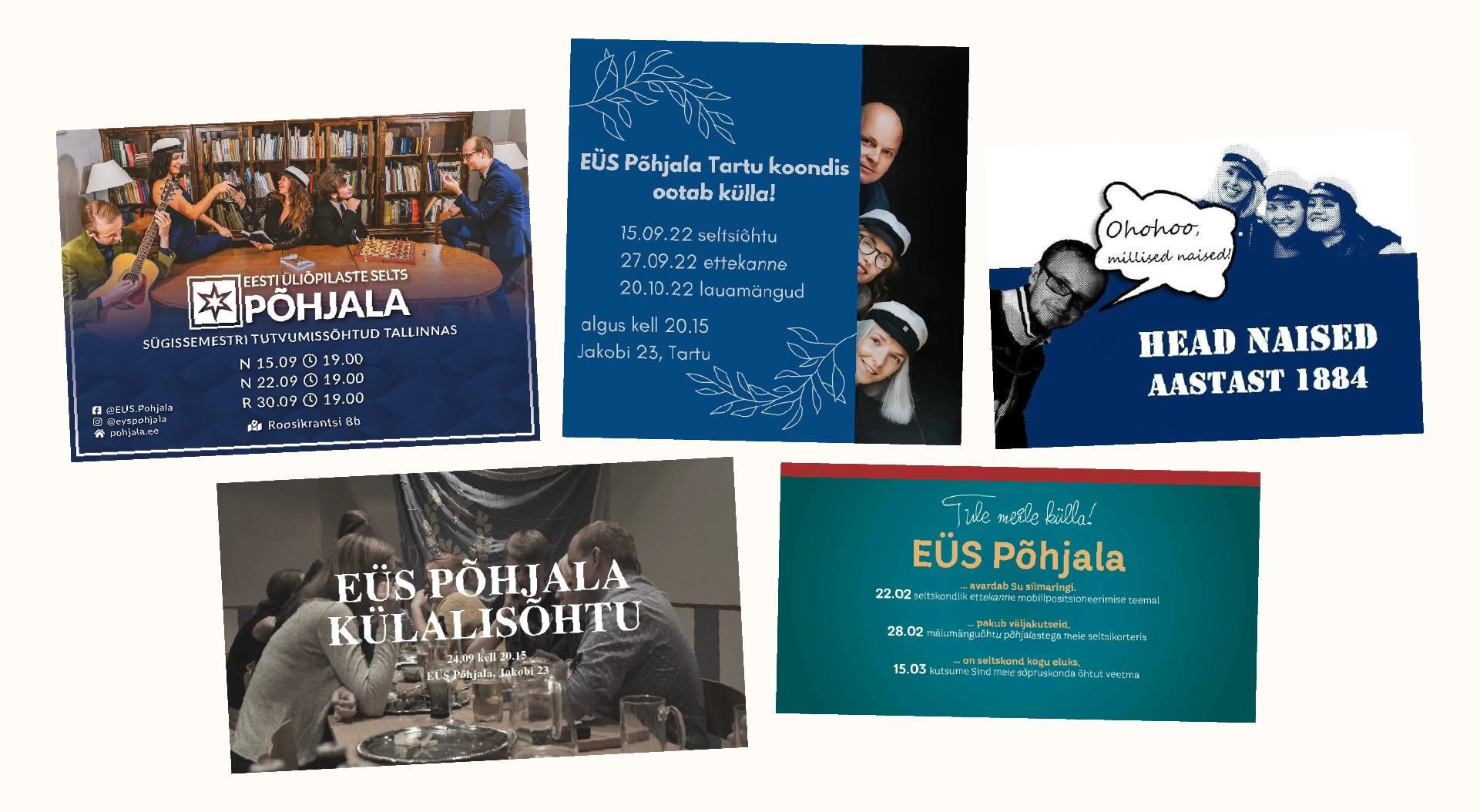
Without a dedicated designer, each recruitment season had produced visuals in a different style, resulting in inconsistent communication across channels. It was clear that the organisation needed to refresh its visual identity.
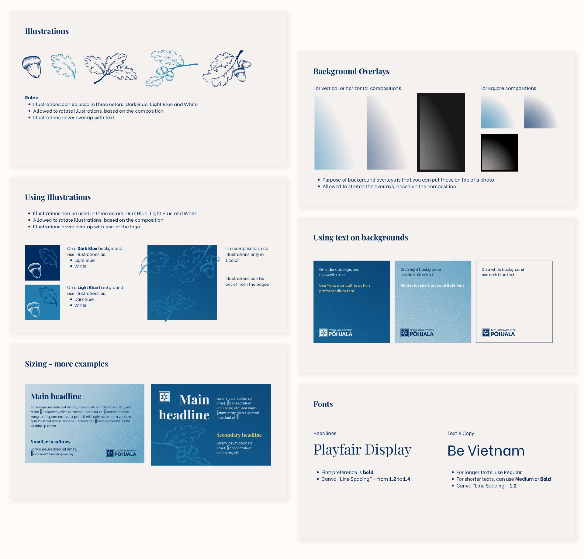
Since communication roles within the organization are often filled by members without a design background, the system needed to be simple and easy to replicate. I developed the system that would be fully usable in Canva.
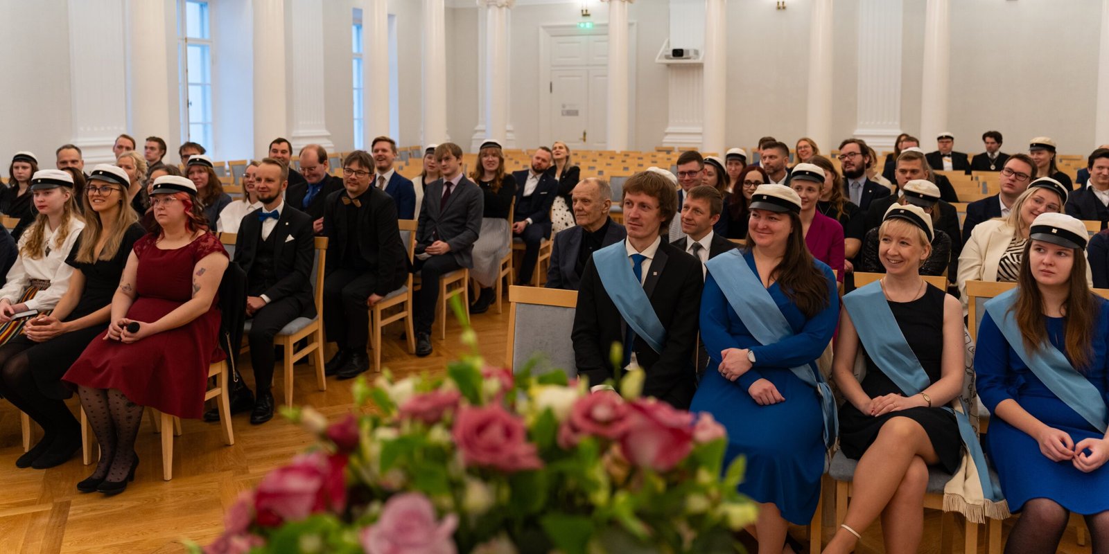
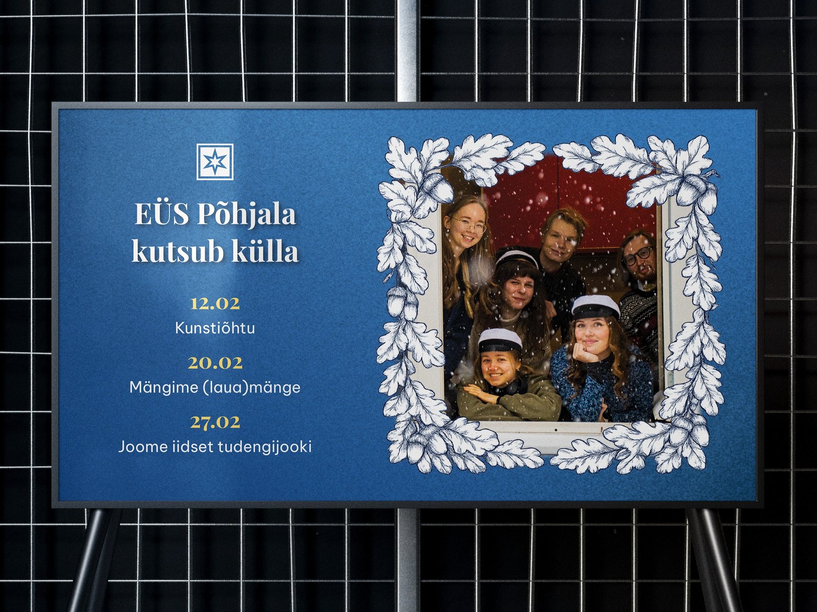
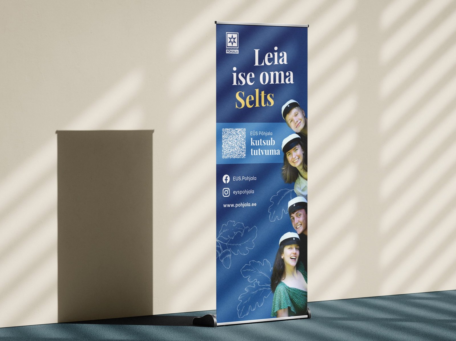
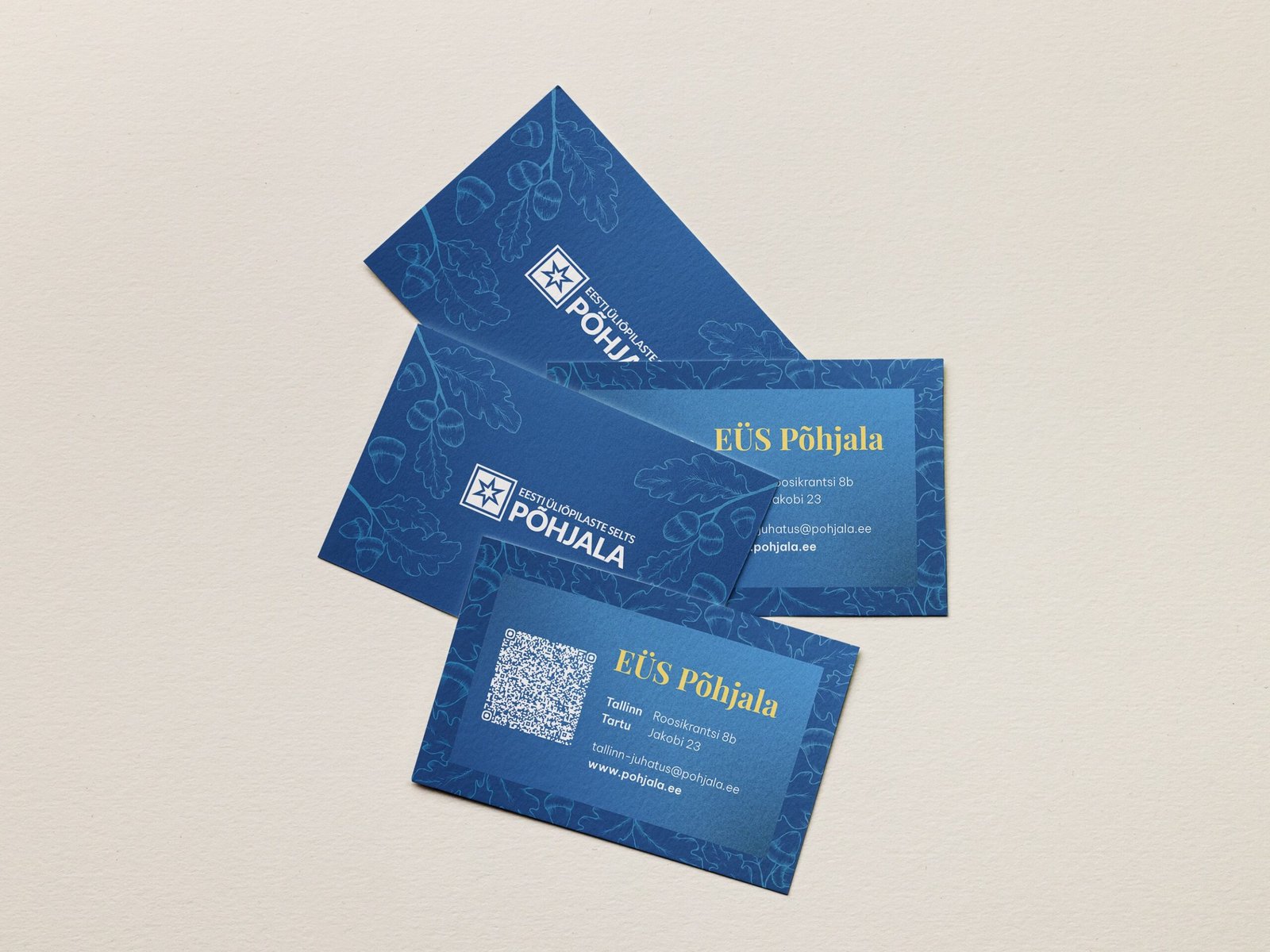
The organization had its key visual elements – dark blue, and oak leaves, which represent the heritage. I evolved these elements by extending the colour palette, creating illustrated oak leaves as a core graphic motif, and centering the system around photography of people. The essence of EÜS Põhjala is its members, and the visuals needed to reflect that.
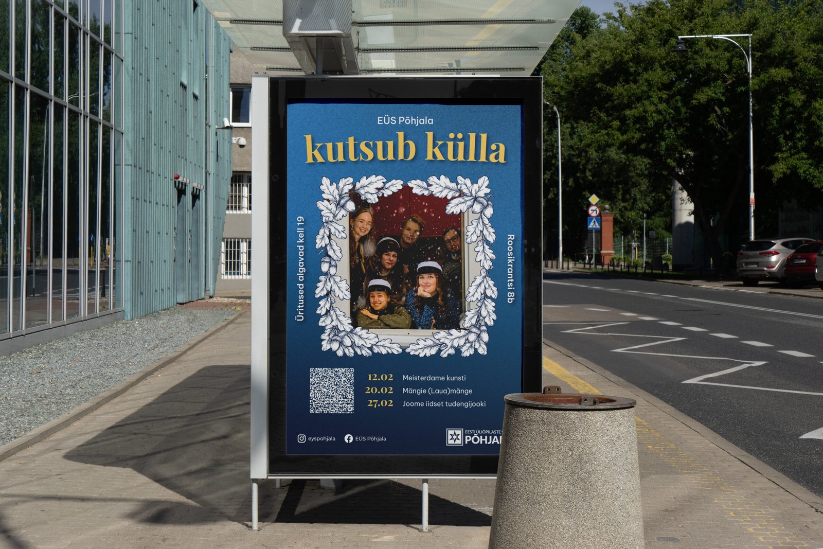
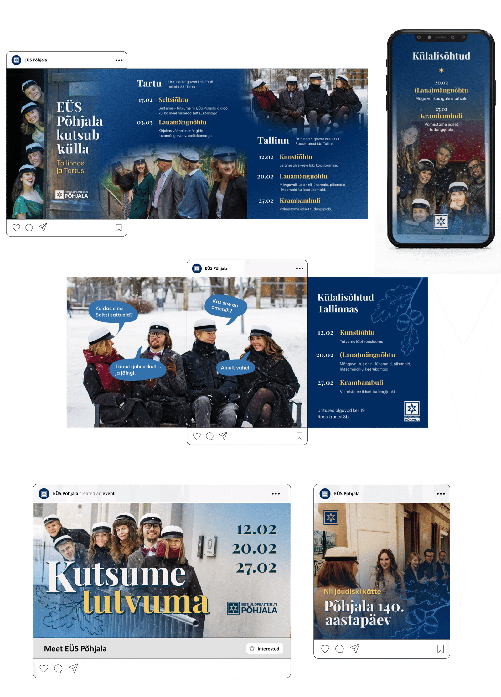
To ensure the identity could be used consistently without my involvement, I produced a visual style guide for future media managers. It covers core design principles and provides practical guidance for members without a design background.
I’m also developing a Canva integration with Claude (Anthropic) to automate visual content creation.