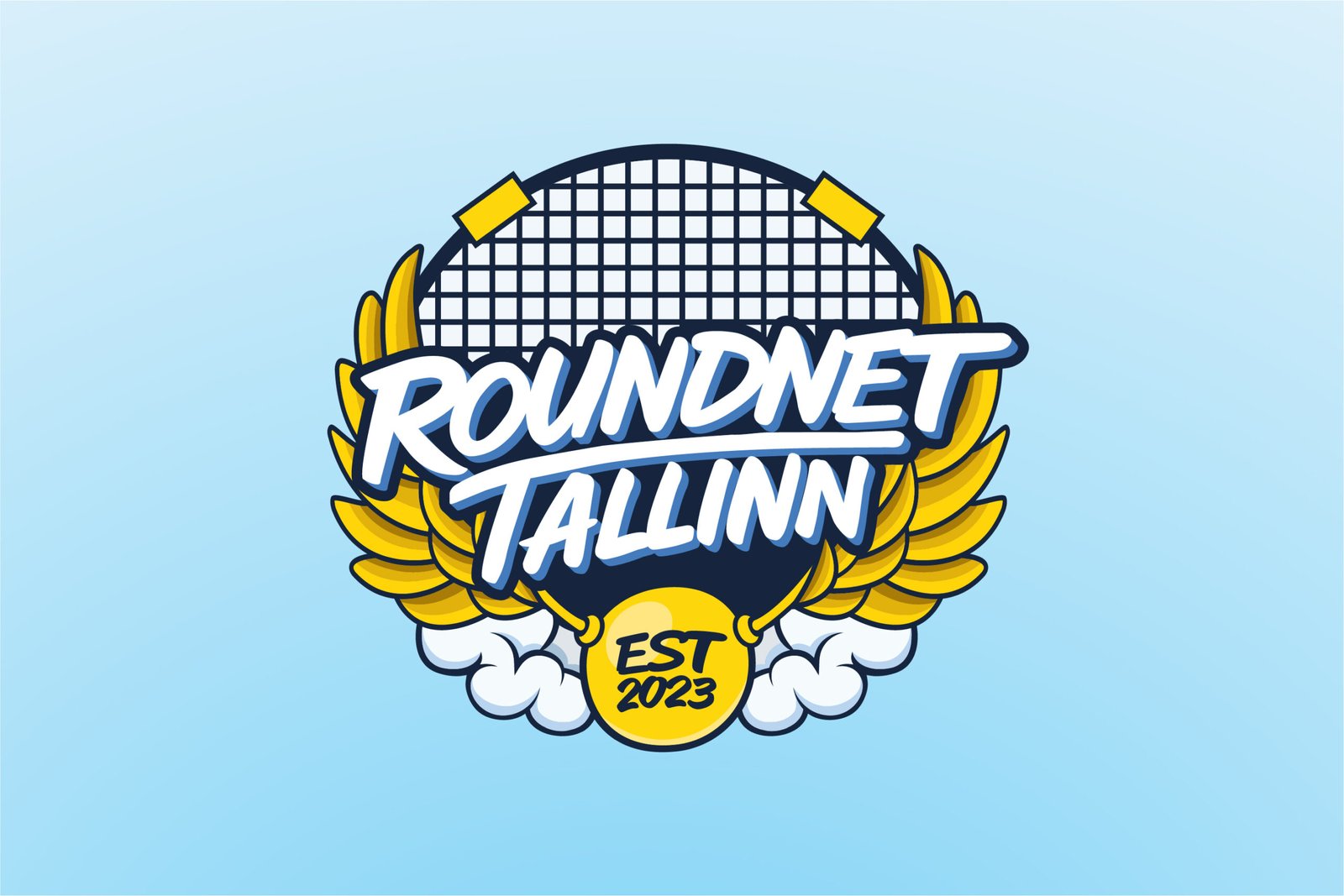
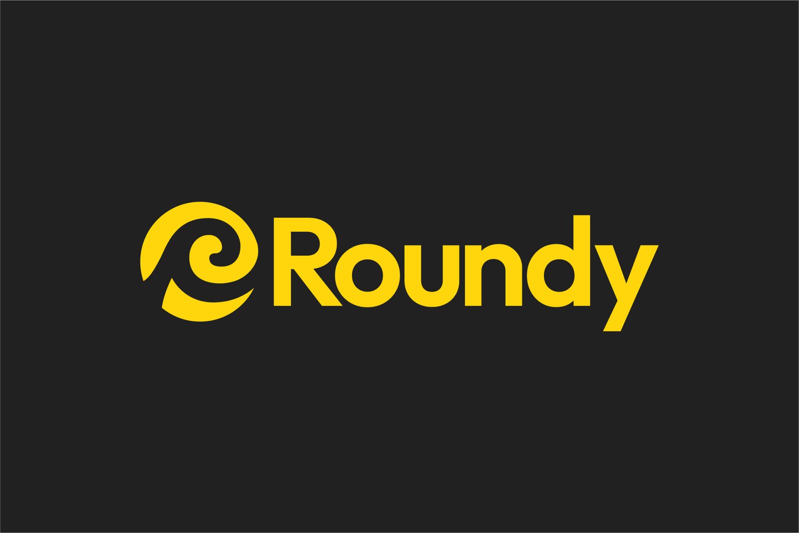
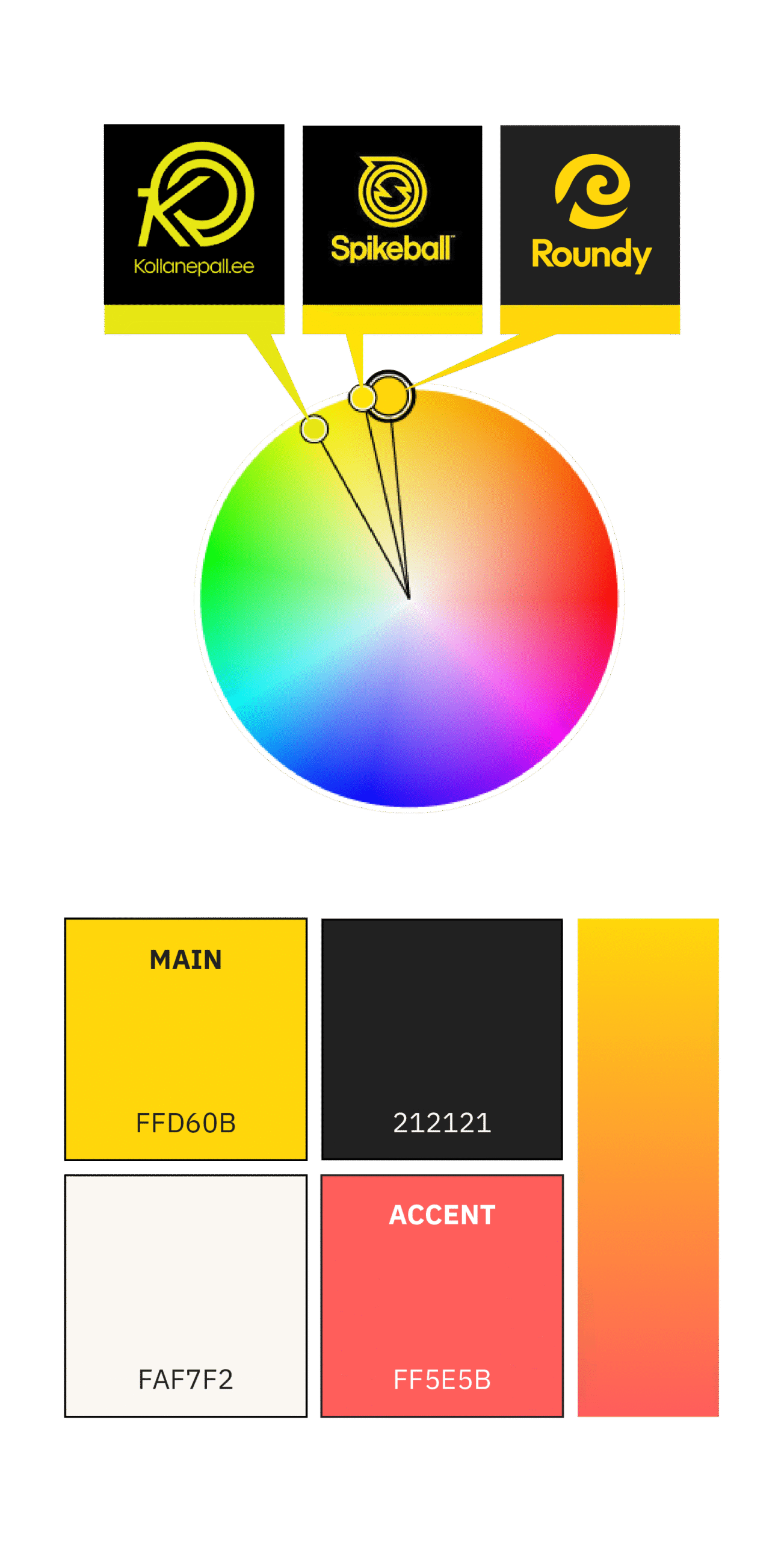
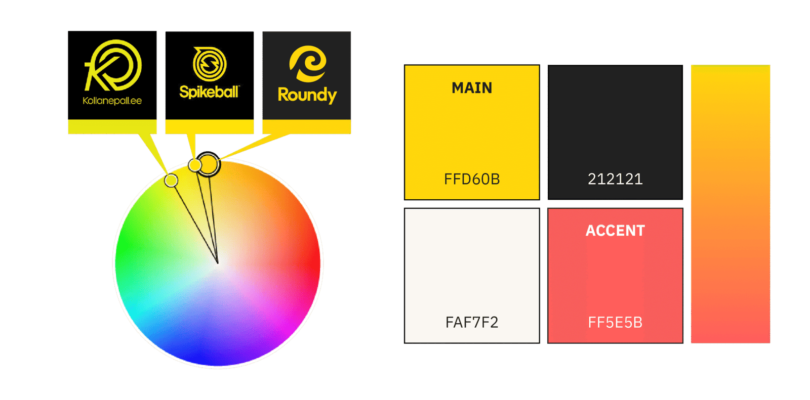
The client originally suggested coral pink as the primary color, but we decided that yellow would be more fitting, as it is strongly connected to roundnet. Since both Spikeball and our main competitor, Kollane Pall, also use yellow, we carefully selected a distinct warm-yellow shade that avoids direct overlap.
We kept the coral pink as an accent color, to have a separating element from the competitors.